Website
AHADI

The landing page for a mental health app called AHADI created by the Tanzania Health and Medical Education Foundation.
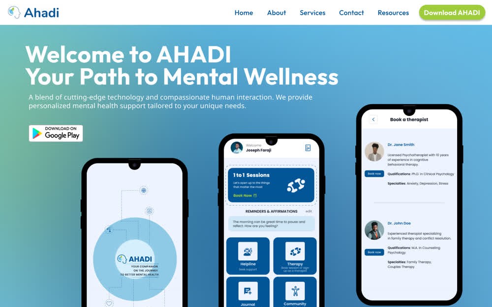
AHADI is a mental health app and previously it didn't have a landing page. With the landing page, the Tanzania Medical and Education Foundation team hopes to reach more youth, provide them with more resources, and share more about the app
AHADI is a mental health product of Tanzania Health and Medical Education Foundation. It was created to provide mental health counseling sessions to youth in Tanzania via the app, WhatsApp Helpline, Phone, and in-person. This product is also offered at the individual level and corporate level.
I joined as a Visual Web Designer through Catchafire, a website that provides volunteer opportunities to help organizations. My main job was to help them design their landing page and scheduling application within their website.
AHADI saw a need for mental health access in Tanzania, so they created an app that provided tools and access to mental health counseling sessions. When I joined, they already had an app in the Google Play Store, but they needed a website that users could go to, to learn more about the services they provide and how they can download the app. In addition, they wanted me to help them design some self-help assessments that they would like on the website that users can take.
After speaking with team members of Tanzania Health and Medical Education Foundation, I designed a mock up landing page for their app that incorporated all of the things they wanted on the website such as their branding colors and real graphics of what the app looks like.
The Design Process
- Empathize
- Define
- Ideate
- Prototype
- Test & Conclusion
Empathize
I received a lot of user information from the lead coordinator who was my main point of contact throughout this project, so I did not do any of the user research. I was provided with the user information and used that to make design decisions.
Target Audience
- Youth in Tanzania
- Young people navigating everyday stress and mental wellbeing
- Some with internet access, some without
Define
Neema, 24
A young adult in Dar es Salaam, managing everyday stress
Balances work and family, and rations her mobile data carefully. She has heard of therapy but never sought it, partly because of the cost and partly out of worry about what people would think. Her phone is a few years old.
- The stigma of being seen seeking mental-health help
- Limited data and an older phone; app-only services feel out of reach
- Cost is a real barrier to formal care
- Doesn’t know what a sensible first step looks like
- A private way to check in on her own stress
- Support that works on the phone she already has
- Plain-language guidance she can act on today
- A clear pointer to real help in a crisis
- Wary of being judged
- Cautiously hopeful
- Overwhelmed by not knowing where to begin
- Tries things privately before telling anyone
- Rations data; avoids heavy downloads
- Trusts family and community over institutions
Ideate
Prototype
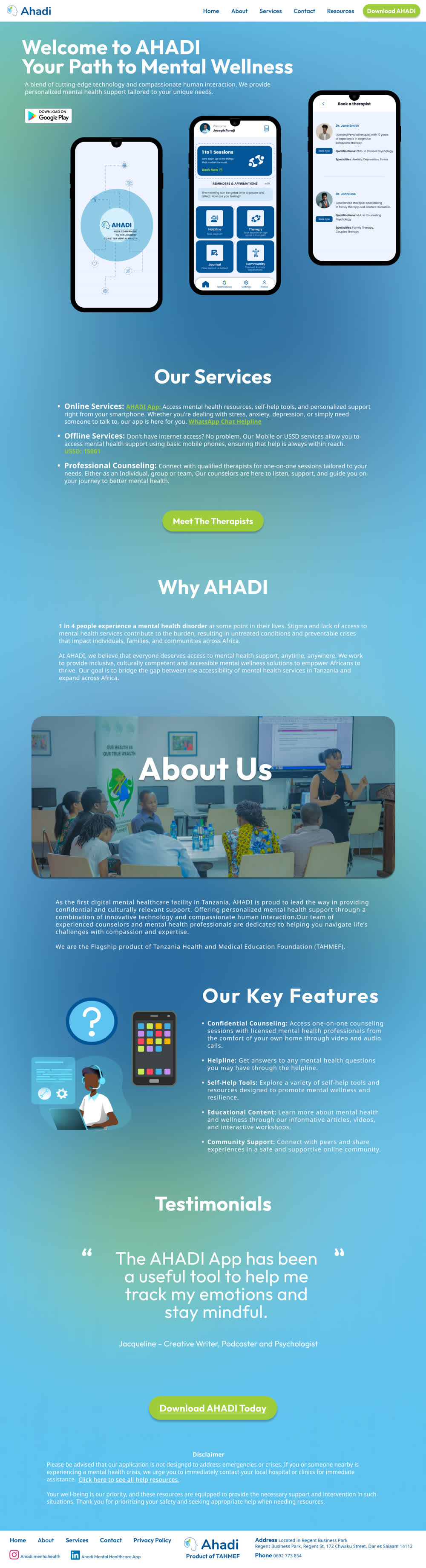
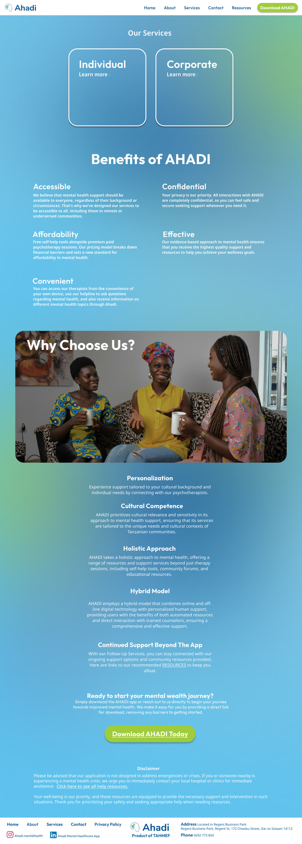
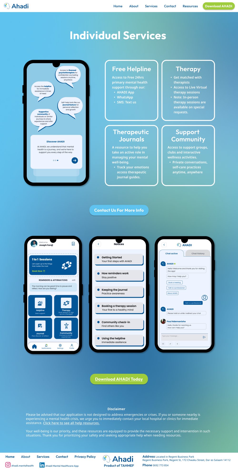
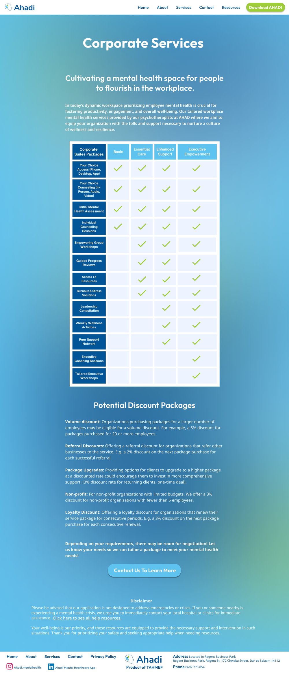
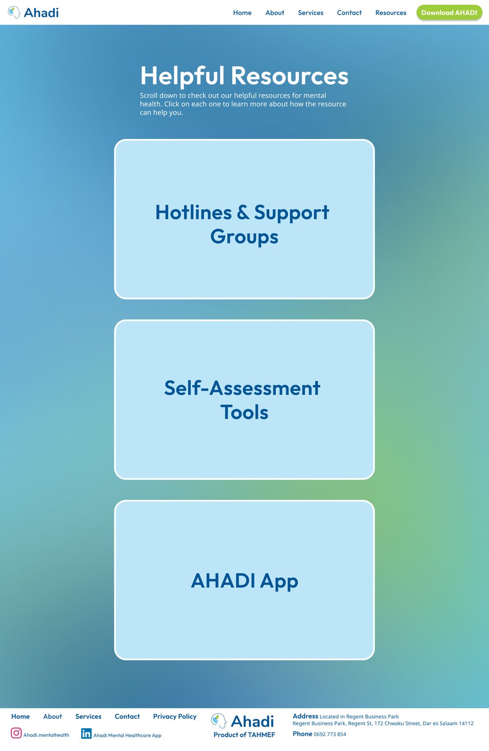
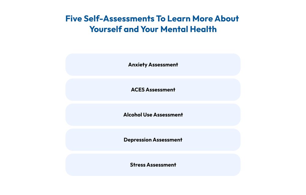
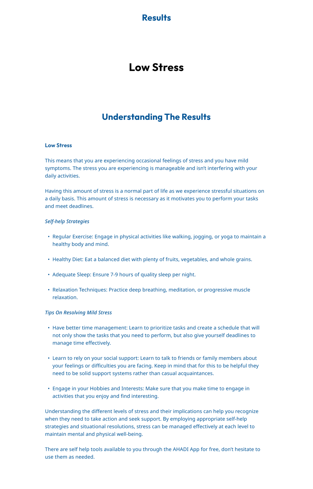
These prototypes are the final prototypes I handed off for this project. Blue and white were the main colors with pops of green for CTA. I used content they provided me with as well such as their logo and app images.

Test & Conclusion
No usability testing was done. Instead, the lead coordinator and other team members reviewed the designs and gave feedback. In the end, they were content with the designs and were highly satisfied with their experience working with me.
- Designing For Clients:
- I learned that it is important to always prioritize what the clients want and involve them in every step of the design process.
- Myself As A UX Designer:
- I gained valuable experience and design skills working on this project. I learned how to do things I’ve never done before like creating a carousel component on Figma. As a new designer, I still have a lot to learn and I am grateful to have gotten this opportunity.