Website
Parent Starts

A concept website where parents learn to raise healthy, resilient children by understanding themselves first, then how their child’s brain grows.
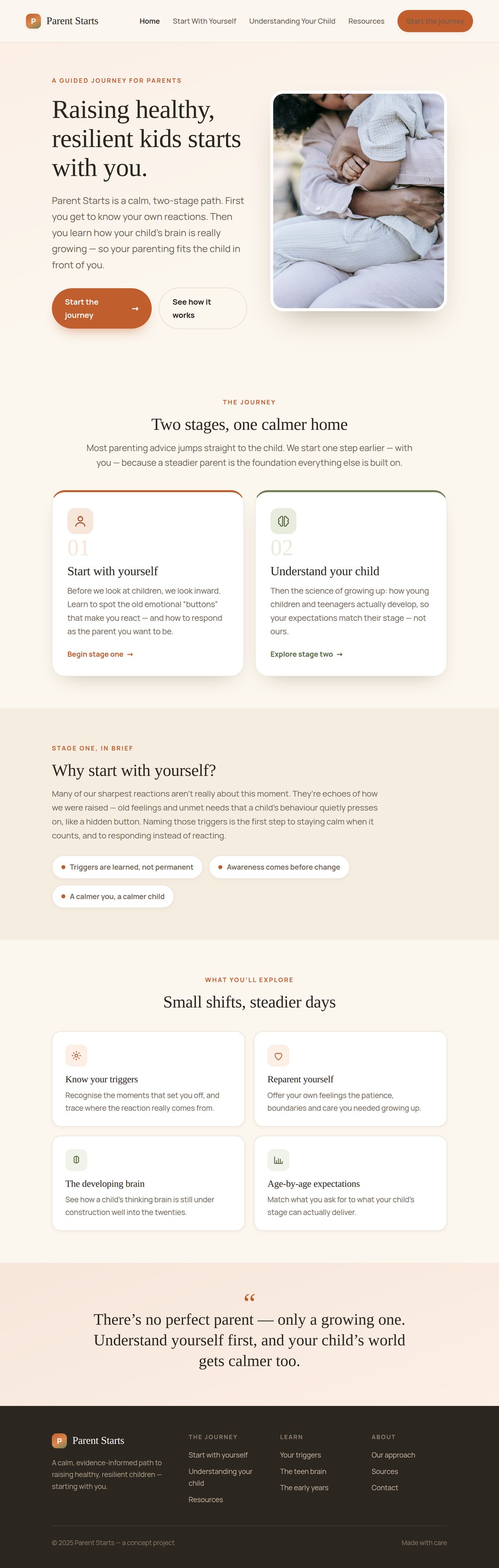
A concept parenting site built on one honest idea: before you can steady a child, you have to understand your own reactions, so the journey starts with the parent, then moves to the child’s developing brain.
Parent Starts is a passion project of mine that I started after talking to many parents at my current job as a Parent Coach and from my own experiences.
I want my parenting philosophy and information on a website that parents can easily find and access for helpful information about parents and children.
Design a website that is accessible and has clear visual hierarchy in order to provide helpful information for parents.
The Design Process
- Empathize
- Define
- Ideate
- Prototype
- Test & Conclusion
Empathize
My research on parents comes from all of the conversations I’ve had with parents as a Parent Coach, learning from my own childhood trauma, and my experiences working directly with children.
Who it’s for
- Parents who want to become better parents
- People who feel they react more strongly than they mean to
- Anyone wanting plain-language, evidence-based guidance
- Parents who want the “why”, with sources they can trust
The site is one path, not a menu: a parent moves from themselves, to their child, to the sources, in that order.
- Home The two-stage journey
- Parent Know your triggers
- Child The developing brain
- Resources & sources
- Triggers guide
- Teen brain
- The early years
- Cited sources
Define
Maya, 38
Working parent of a 13-year-old, trying to stay calm through the teen years
Maya grew up in a home where big feelings were shut down, and she catches herself doing the same. She wants to parent differently, but the advice she finds skips straight to the child. She’s ready to change: she just needs a calm first step and sources she can trust.
- Reacts faster and louder than she means to
- Reads normal teen behaviour as disrespect
- Advice she finds jumps to the child and skips her
- Unsure what’s a real problem vs. a stage
- To understand why she reacts the way she does
- Plain-language insight into the teen brain
- A calm first step she can take today
- Trustworthy sources she can go back to
- Guilty after flashpoints
- Willing to change
- Overwhelmed by conflicting advice
- Googles at 11pm after a hard evening
- Wants the “why”, not just the “what”
- Bookmarks sources she trusts
Ideate
Prototype
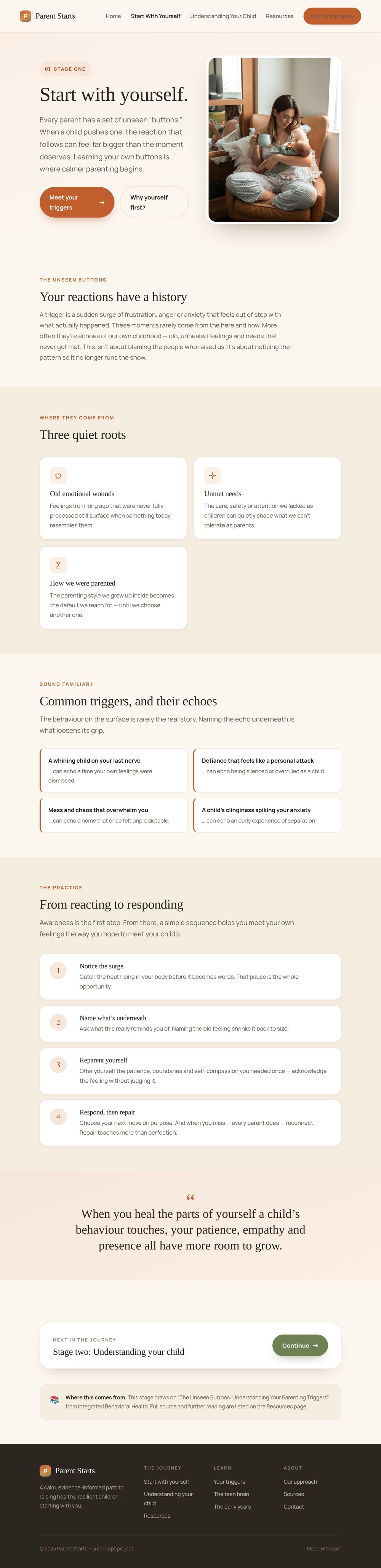
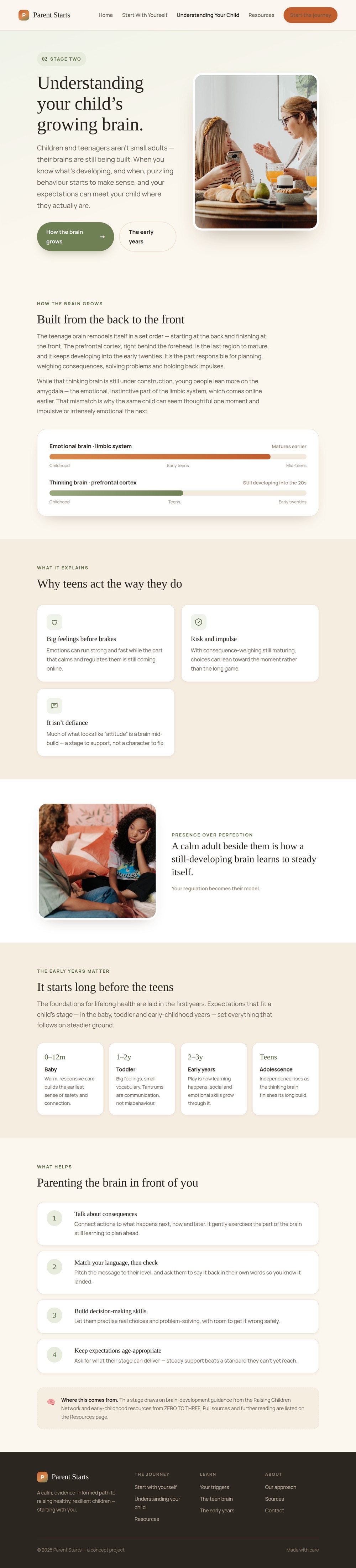
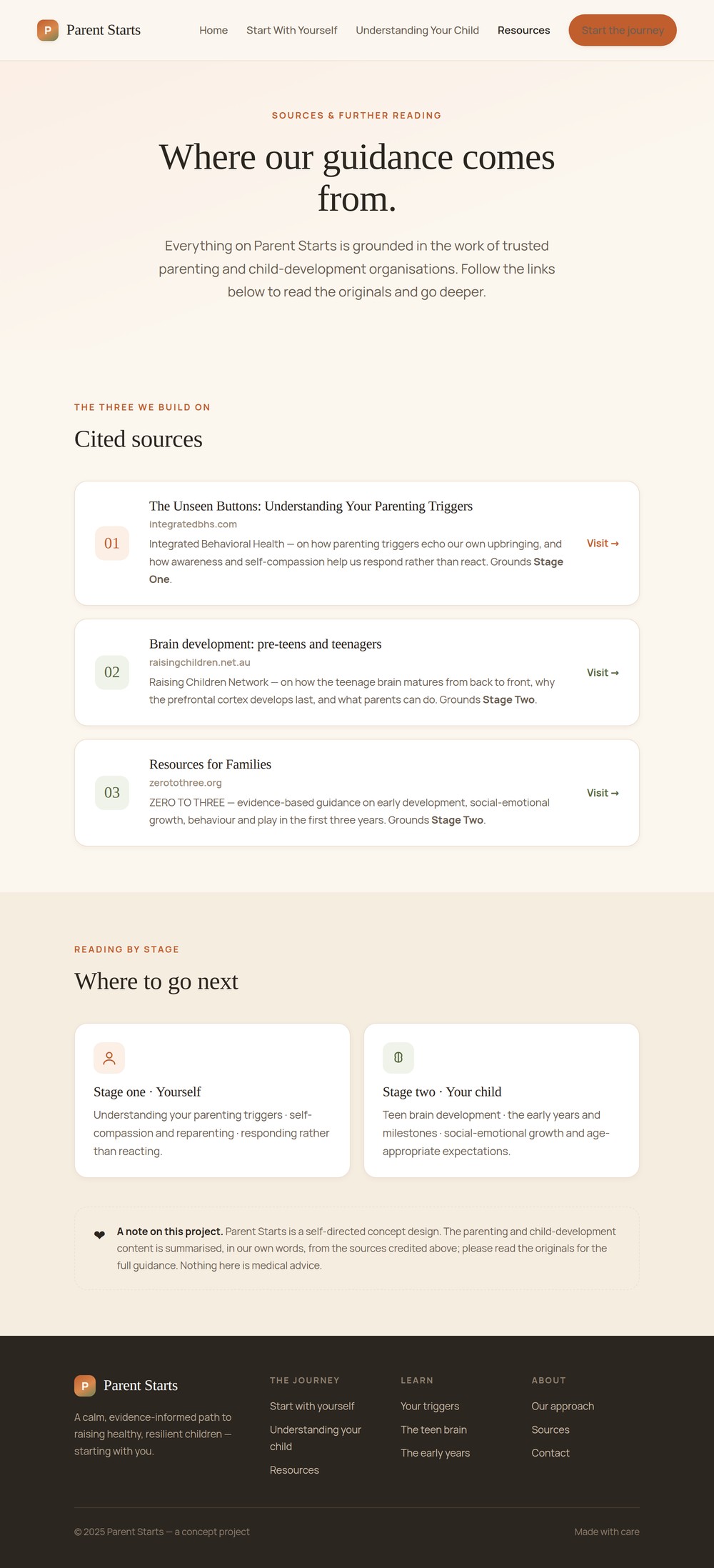
These are the four final screens. Light green carries the parent’s own journey and blue carries the child’s; a clean white canvas and a serif display face keep the whole thing calm and human. Photography is warm and candid, and every screen holds a single primary action. I designed each screen with a clear visual hierarchy so the content is easier for parents to consume.
Test & Conclusion
I have not tested this design. If I were to test it, I would share the website on social media as a parenting resource for parents who are looking to learn more about parenting and child development. I can also create an anonymous survey on the website for any parents who want to give feedback on the website.
Knowing your audience. It helps so much when making design decisions. I am very lucky to have gotten the chance to speak with many parents from my job as a Parent Coach.
- Integrated Behavioral Health, “The Unseen Buttons: Understanding Your Parenting Triggers” Stage one: parenting triggers as echoes of our own upbringing, and reparenting ourselves.
- Raising Children Network, “Brain development: pre-teens and teenagers” Stage two: how the teenage brain matures from back to front, and what parents can do.
- ZERO TO THREE, “Resources for Families” Stage two: evidence-based early-childhood development in the first three years.